How to Use Color Psychology in Marketing and Branding
Colors are more than just visual elements—they’re powerful tools in marketing and branding. Color psychology explores how different colors influence our feelings and behaviors. When used strategically, colors can enhance your brand’s identity, evoke specific emotions, and even drive consumer actions. For instance, blue often conveys trust and reliability, while red can ignite excitement and urgency.
Understanding these associations lets you make informed choices about your brand’s color scheme, helping you connect more effectively with your audience. This article will explore how to use color psychology in marketing and branding to boost your efforts and create a compelling brand presence.
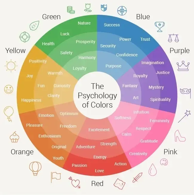
Color Psychology Basics
Color psychology studies how colors
influence our emotions and behaviors. Each color carries its own set of associations and meanings.
For example, yellow is often linked with happiness and energy, while green is associated with growth and calm. These associations can vary depending on cultural context and personal experiences, but they provide a general guide for how colors might impact your audience.
In marketing, understanding these associations helps you align your color choices with your brand’s message. For instance, if you want to promote a sense of trust and dependability, you might choose shades of blue. If you aim to energize and motivate, bright colors like orange or red could be more effective. That said, knowing how different colors resonate with people enables you to craft a brand image that speaks to your audience on a deeper level.
Modern research shows that people form visual impressions within milliseconds, and color plays a major role in that first reaction. In digital environments, especially, users often decide whether to stay on a website based on visual appeal alone. That makes color selection a performance factor, not just a design choice. Strong contrast improves readability, while thoughtful combinations guide the eye toward important elements. Accessibility also matters. Designing with sufficient contrast ratios and considering color blindness ensures that your brand remains inclusive and usable for all audiences. As competition increases across digital platforms, brands that use color intentionally gain a measurable advantage in engagement and retention.
How to Choose the Right Colors for Your Brand
Choosing the right colors for your brand matters. After all, you want the colors of choice to align with your brand’s values, maintain consistency, and resonate with your audience. Now, let’s see how you select the right palette!
Identify Your Brand Values
Selecting the right colors for your brand involves more than picking your favorites. Begin by identifying your brand’s core values and message. For example, if your brand promotes health and wellness, you might choose soothing greens or blues. If you emphasize innovation, bold and vibrant colors like orange or purple could be more fitting.
Your color palette of choice should visually communicate what your brand stands for, helping to reinforce your brand’s story and values. Once you have the colors, it’s time to use them everywhere: on the packaging, promotional materials, social media, and especially your website. The latter is especially important because
web design affects conversions. Believe it or not, the right color palette can majorly influence user behavior and guide them toward the desired action.
Understand Your Audience's Preferences
Speaking of user behavior, different colors can evoke various reactions, so it’s important to consider your target audience when choosing colors.
For instance, younger audiences might be drawn to vibrant, energetic colors, while older demographics might prefer more subdued and classic tones. You can use methods like A/B testing to gauge your audience's preferences. This involves creating two versions of a marketing piece with different color schemes and comparing which performs better.
Maintain Consistency Across All Platforms
When it comes to brand colors,
consistency is crucial. As we already mentioned, using the same color scheme across all marketing channels—such as your website, social media, and print materials—is important. This uniformity builds brand recognition and trust and creates a cohesive look. Utilize color palettes and create a branding guide to maintain this consistency and avoid confusing your audience with mismatched colors.

Colors and Consumer Behavior
We’ve already briefly touched upon colors and their power to influence user behavior. That said, the right color choices can influence buying decisions and brand perceptions. Research shows that red can create a sense of urgency, often leading to quicker purchasing decisions. Blue, on the other hand, as mentioned, is associated with trust and reliability, making it a popular choice for financial institutions and tech companies.
Brands like Coca-Cola and IBM effectively use color psychology to strengthen their brand identity and appeal to their target audiences. Coca-Cola’s use of red is energizing and stands out, while IBM’s blue conveys stability and professionalism. By understanding how colors impact consumer behavior, you can tailor your marketing strategies to engage your audience better and drive desired actions.
Practical Tips for Implementing Color Psychology
To use color psychology in marketing and branding, start by integrating your color palette into key materials like your logo, website, and ads, ensuring they enhance your brand message and evoke the right emotions for effective branding . Use A/B testing to gauge how well your colors resonate with your audience by comparing different color schemes and seeing which performs better. Additionally, avoid common mistakes such as using clashing colors or overly contrasting hues, which can make your brand seem disjointed. Instead, aim for a harmonious color scheme that reflects your brand’s personality.

Brands That Got Color Psychology Right
Examining successful brands reveals how effective color choices can enhance brand identity. Discover how McDonald’s, Tiffany & Co., and Starbucks use color to strengthen their branding.

McDonald’s Golden Arches
McDonald’s iconic use of yellow and red is a prime example of effective color psychology. The bright yellow in the Golden Arches symbolizes optimism and energy, while red stimulates appetite and attracts attention. This combination has successfully created a vibrant and engaging brand presence that draws customers worldwide.

Tiffany & Co.’s Signature Blue
Tiffany & Co. is famous for its distinctive Tiffany Blue, representing elegance and exclusivity. This unique shade of blue helps the luxury jewelry brand stand out and establishes a sense of prestige. The consistent use of Tiffany Blue in packaging and branding reinforces the brand’s high-end image and enhances its identity.

Starbucks’ Green Harmony
Starbucks employs green to reflect its commitment to sustainability and create a relaxing atmosphere. The color green, associated with growth and tranquility, aligns with Starbucks’ values of environmental responsibility and comfort. This choice helps the coffeehouse chain create a welcoming and eco-friendly image, resonating well with its environmentally conscious customers.

[ THE TAKEAWAY ]
Mastering Color Psychology in Marketing and Branding
Incorporating color psychology in marketing and branding strategies can significantly impact how your audience perceives and interacts with your brand. By understanding the emotional and behavioral effects of different colors, you can make informed decisions that enhance your brand’s identity and effectiveness. As seen with successful brands like McDonald’s, Tiffany & Co., and Starbucks, the right color choices can create a powerful and memorable impression. So, choose your color palette carefully and test its impact to ensure it aligns with your brand’s message and resonates with your audience. That’s how you will build a stronger, more engaging brand.
If you need more help or deeper professional guidance, please feel free to
contact me today.