The Battle for the Hands: Why Physical Quality Still Wins
You’ve likely heard the marketing mantra that you have only a few seconds to make a first impression. Research from the Missouri University of Science and Technology actually puts a finer point on it: it takes less than three seconds for a user’s eyes to land on the key area of your website that determines their first impression.
In a digital-first world, we obsess over those three seconds. We tweak "hero" images, A/B test email subject lines, and agonize over the hex code of a "Call to Action" button. We are winning the battle for the eyes.
But there is a deeper, more primal battle happening that most marketers completely ignore. It’s the battle for the hands.
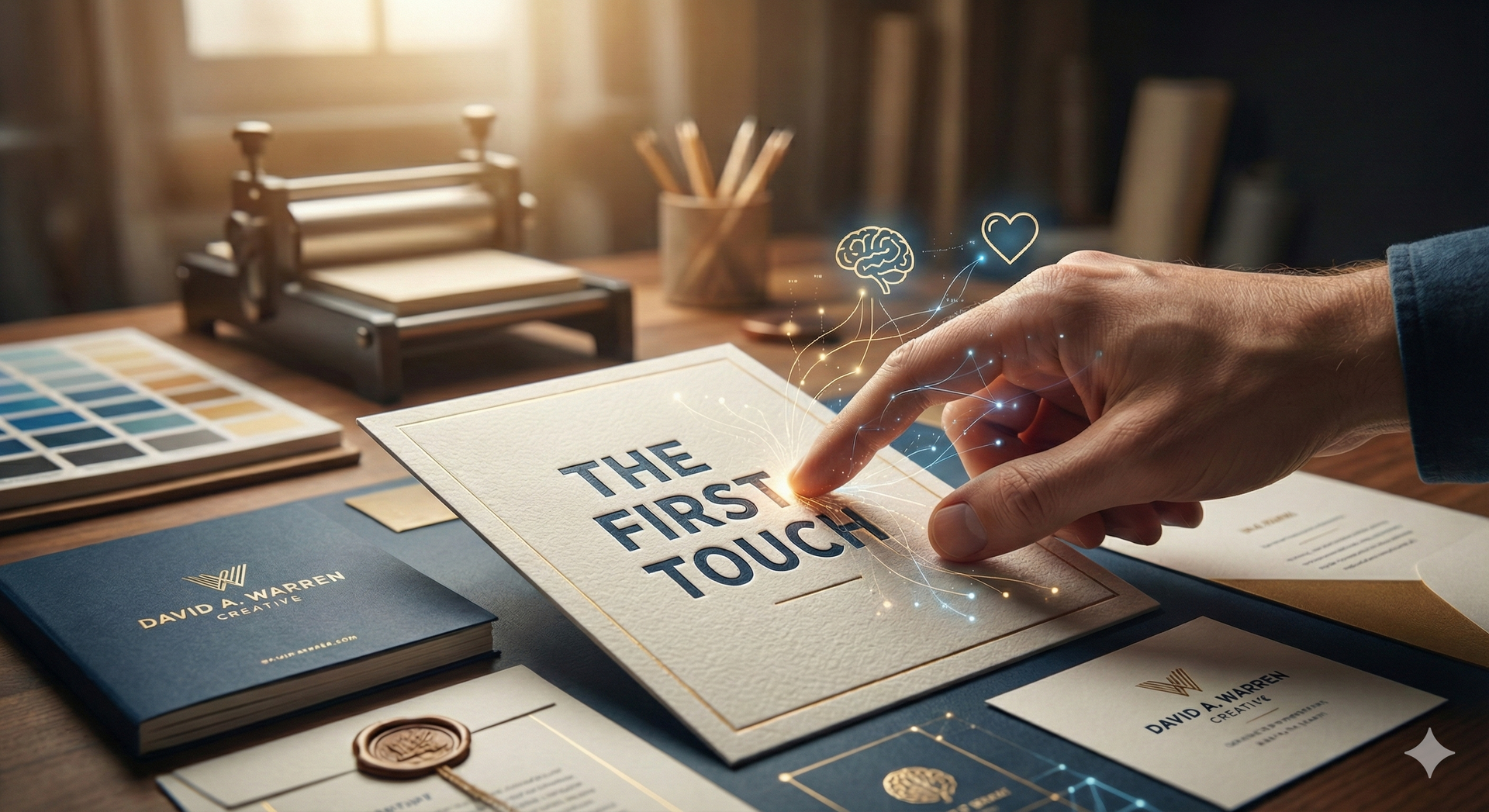
With a 20-year career in design—the last 11 of which I’ve spent as an Art Director and Creative Director—and a childhood spent helping my father build and fix everything in his shop, I’ve realized that the most powerful impressions aren't just seen—they are felt. This is the science of
Sensation Transference, and it’s the reason why physical touchpoints are still the most underrated weapon in your growth strategy.
The Science of Sensation Transference
In the 1940s, psychologist Louis Cheskin discovered something fascinating: Humans are often incapable of separating the packaging from the product.
In his book Why People Buy, Cheskin proved that if you put the exact same product in a higher-quality container, people will swear the product itself is better. They "transfer" the physical sensations of the package onto the value of the brand.
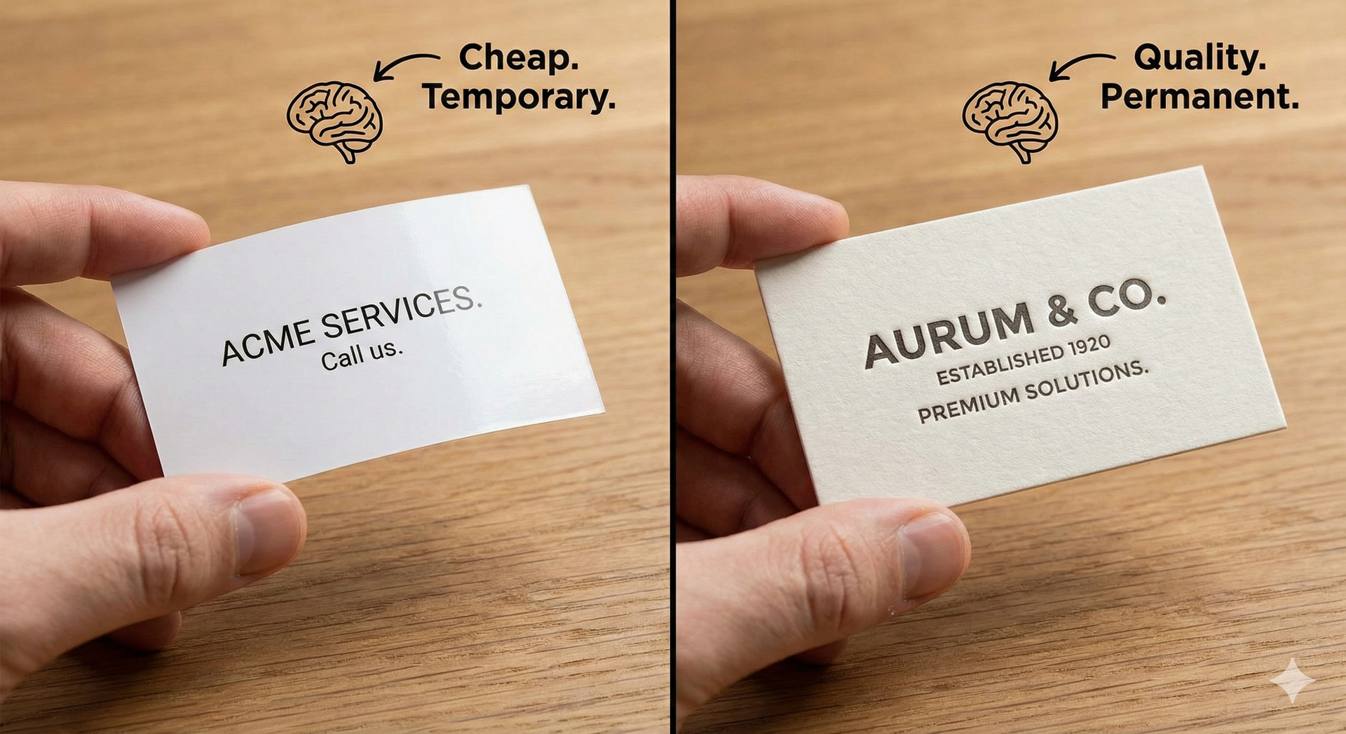
This is where the battle is won or lost. If you hand someone a business card that is flimsy and light, their brain doesn’t just think "this paper is thin." It subconsciously concludes: "This business is thin. This business is temporary. This business is cheap."
Conversely, when a brand invests in weight, texture, and detail, they aren't just giving you information—they are giving you a sensory experience that says:
"We are established. We are detailed. We are permanent."
The Woodworker’s Metaphor: The 400-Grit Finish
In my shop, I can build two identical tables out of walnut.
One is sanded to 120 grit and finished with a quick spray. The other is sanded to a glass-like 400 grit and finished with hand-rubbed oil that invites you to touch it. Both tables hold a coffee cup just fine. But the hand-rubbed table feels "generational." It feels like it has a soul.
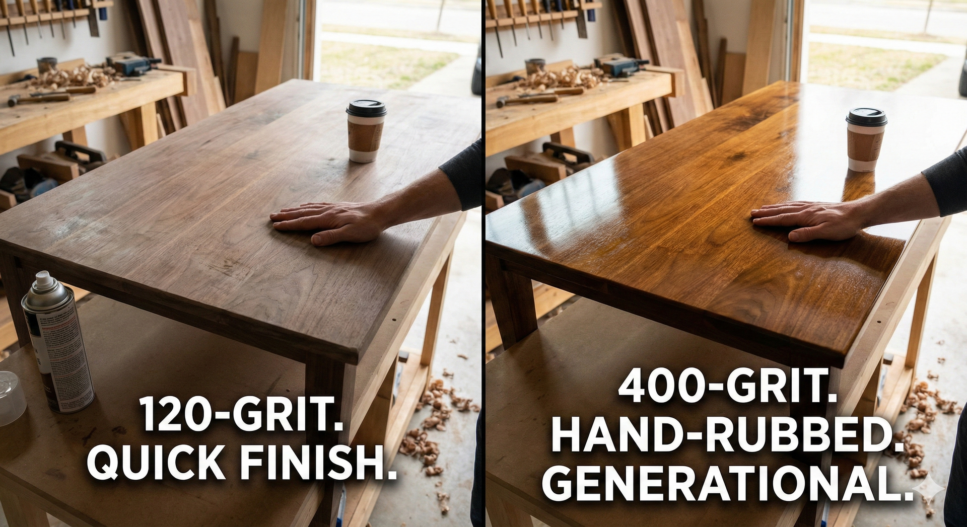
Marketing is the "finish" of your business.
If your digital presence is clean, but your physical touchpoints feel like an afterthought, you are creating a "broken joint" in your brand. End of woodworking metaphor, back to print marketing.
Case Study 1: The "Weighted Importance" of SilkCards
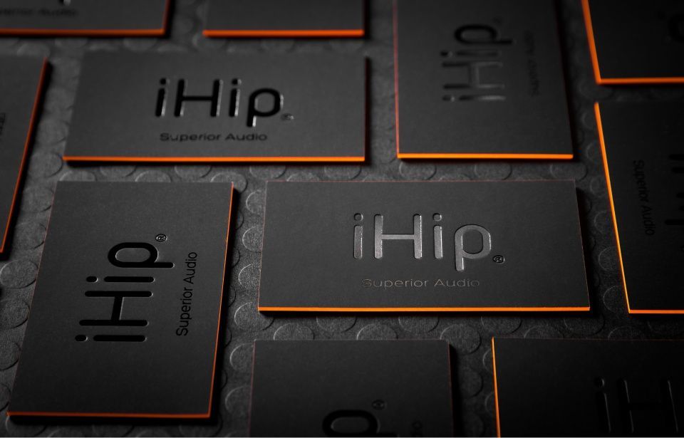
When I look at companies like SilkCards, they are essentially hacking neurobiology. By using 32pt or 48pt multi-layered cardstock, they make a business feel "heavier" in a prospect's hand.
In social psychology, weight is a metaphor for importance. When a recipient’s thumb catches on the raised ridge of a Spot UV logo or the soft-touch texture of Suede Lamination, it triggers a moment of physical curiosity. That micro-second of engagement creates a much stronger memory than a flat, digital image ever could.
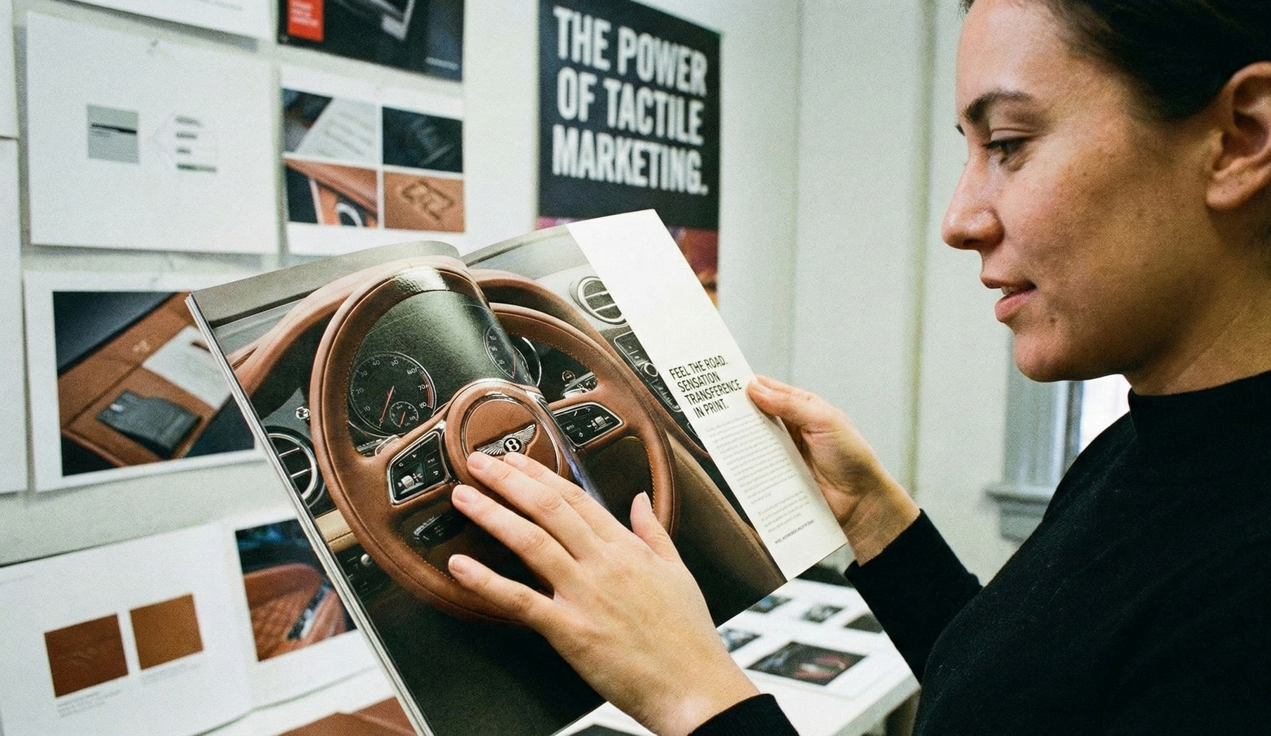
Case Study 2: Winning the Unboxing Experience with Suay
Sensation Transference isn't limited to paper; it extends to the entire "unboxing" journey (and then some). I recently had an experience with the apparel brand Suay that serves as a perfect example of winning the "first touch."
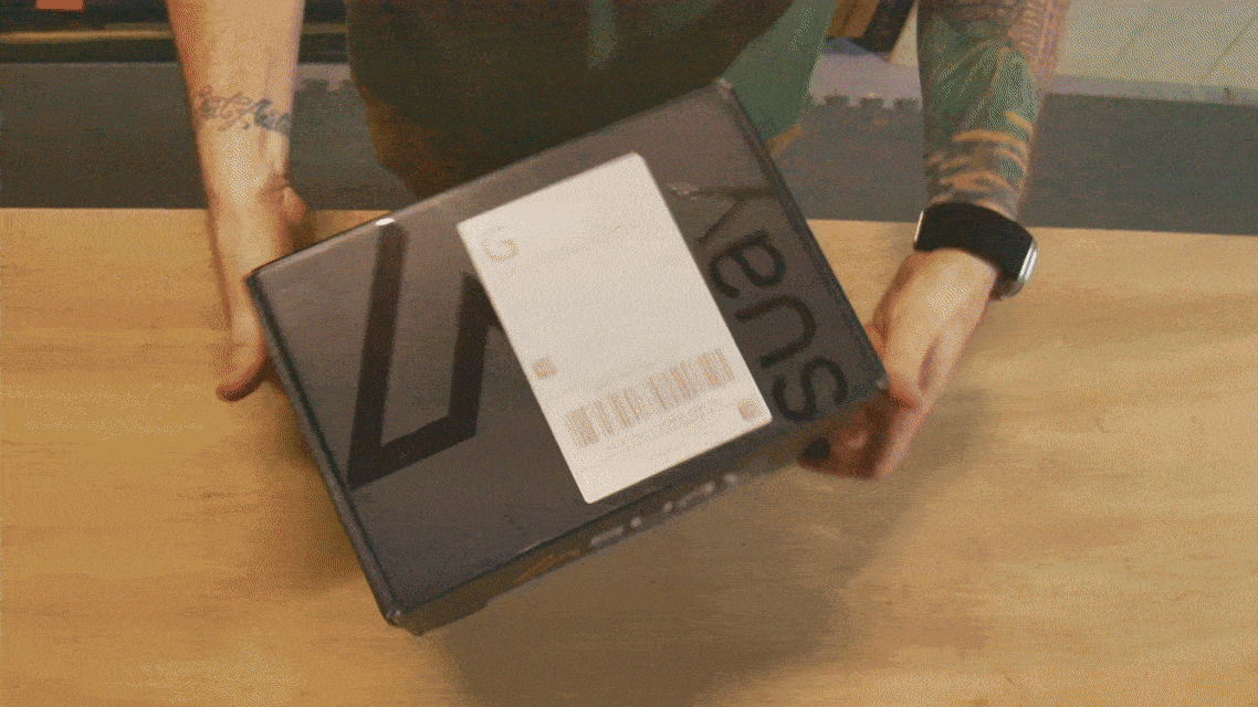
The moment the shipping box arrived, the "battle for the eyes" was won with a modern, fully branded exterior featuring
Spot UV printing. But the real magic happened when I opened it:
- The Interior: A clean, smooth, fully printed interior greeted me, featuring a QR code for immediate digital "next steps."
- The Secondary Layer: The hats didn't arrive in plastic; they were tucked inside a high-quality, branded drawstring bag.
- The Product Detail: The hats featured premium branding in multiple locations—inside and out.
Because of the quality of the packaging, I didn't just feel like I bought a hat; I felt like I had joined a high-end brand ecosystem. When a customer sees your logo from every angle on a premium-feeling product, they transfer that "premium" feeling to your entire company.
How to "Finish" Your Brand
If you want to use this science to grow your business, you need to think beyond the screen. Here are a few ways to bridge the gap:
- Haptic Contrast: Use Spot UV or Raised Foil to create a contrast between matte and gloss. This "rewards" the user for looking closer.
- Weighted Assets: If you use print, double the thickness. Make it an object, not a scrap of paper.
- The "Hidden" Detail:
Like the interior printing on a Suay box, find a place to put a detail that only the customer sees. It signals that you care about the parts of the job that aren't "for show."
[ THE TAKEAWAY ]
Building a brand is about building trust. And trust is built on consistency.
Stop thinking about your marketing as "ads" and start thinking about it as "joinery." Whether it's the card in their hand or the box on their doorstep, ensure every touchpoint feels generational.
David A. Warren is a Creative Director and Woodworker who believes in Clean Design, Clear Messaging, and Human Psychology. Discover more at DavidAWarren.com.